ACETATE IMAGES
SKELETON DEVELOPMENT
After creating the skeleton, I wanted to develop this idea further and create a stronger relation to lace, so I copied the skeleton onto acetate and began to layer the images over one another to create patterns.
This turned out really well and in my opinion the patterns created through the layering of the image made some beautiful designs that change the entire piece.
Unsuccessful:


This one is too plain and doesn't overlap much, however the section that does gives a slight steampunk effect, with cogs at either side due to the parts that stick out. I think this one and the one below as a whole kind of look like a bug or insect. The one below makes me think of a tortoise.

My Favourites:

I originally placed the skeletons in this circular pattern as it was the first idea that came to my head, and it turned out well due to its resemblance with a doily or table mat. In this one, the overlapping in the centre looks like a sun you would draw as a child (personally it reminds me of the teletubby sun). The centre of this piece looks really dark, but when you look closely you can still see more of the symmetrical pattern where each skeleton overlaps.

This one in particular really reminded me of an x-ray image, but I'm not too sure why. I think it may be due to the way every skeleton is perfectly straight and all have the same distance between them.

I like the way the overlapping created a whole new image, especially in this one which looks like a fish or an alien

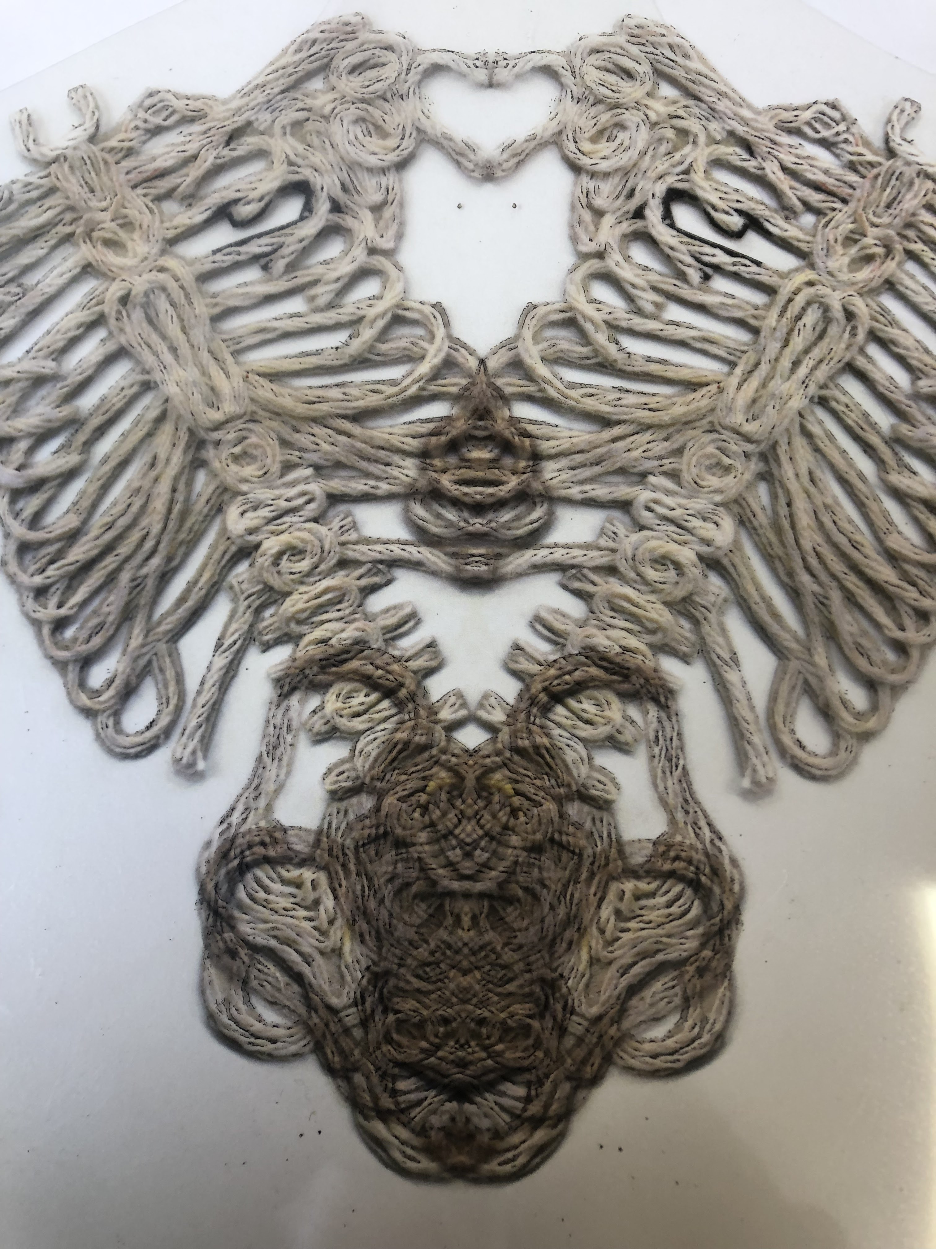
This one reminds me of a hairless Siamese cat. I like the fact the images you pull from these can be completely open to interpretation, similar to the well known optical illusion images, or the images you see in films which a therapist may show someone and ask 'what do you see in this picture'.


This piece in particular makes me think of lace. It works in a circle from the centre outwards, a lot like a doily or flower. It looks as though the string has been intertwined and wrapped round one another to create the pattern. The layering creating a contrast pushes forward a whole new design/pattern that is completely symmetrical. This piece looks to me like it could be on a table runner due to how linear it is and the way it looks like its been woven.


The composition of these pieces feels more organised and thought about, whereas the previous ones looked slightly messy and the patterns weren't interlinked as well. The interlinking of the skeletons resembles the weaving of thread and the way threads are passed through one another.
Intro to a series on Netflix called Dark, set in Germany

The acetate images made me think of the intro to a series I'm watching at the minute with short scenes that are flipped which gives a trippy effect. The colours of the videos are dark and moody to link to the storyline of the series. I want to play with colour to make my images more moody, similar to the way this series intro looks.
For a final piece, I want to photoshop the colours on these images and print them out putting them into frames. I really like the way some of these acetate images turned out and the strong link they gave my skeleton to the lace project.


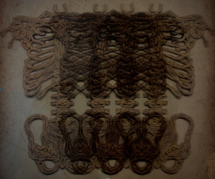


Here are some of the pictures I attempted to edit. The first and third are quite similar but I prefer the third one more as I like the lines that look like scratch marks that are going in different directions, whereas the filter on the first one has lines that are all vertical. They look like old images taken on a film camera. The middle image has a sort of bright pink smoke effect over the top of it, with the opacity turned down so the image is still visible. I like the colours but I feel it would look better if the background was black instead of white. I couldn't edit it because when I tried, the string image just didn't show up as well. If I did this with the original cut out rather than the acetate images, it probably would have worked better. I do like the colours in the image though but the overlapping of the string isn't as clear in this image because of the pink.
I really like the last two images, I feel they turned out better than the first three because the pattern created by the layers is still really visible, and both the edits give more of a similar vibe to the intro to 'Dark', which was my intention. The bottom one is the best out of the two as the blue yellow & black work really well together. I said this image in particular reminds me of a fish or an alien, and the way its edited looks like space or water, so it fits well with the acetate picture.

Comments
Post a Comment