STUDYING HARES
To start off my second project based round hares, I wanted to experiment more with styles, medias & colours to see varying ways in which hares can be presented & how/what changes can change the mood of the piece.


To start with I wanted to add some sort of human object in with the hare that fits the theme of Newstead Abby, so I put a ruff around the hares neck which is an item of clothing wealthy people used to wear. As this is what people with power & wealth commonly wore, I felt the hares positioning needed to show this so I drew him sat with good posture, quite tall with his ears up. I then decided to add a wash of brown & yellow to colour the hares fur, & then a red tone to the collar so it wasn't too heavily contrasting with the rest of the hare. I used coloured pencils for this. Adding colour to this piece was a decision I made after the sketch as I felt it looked too flat & didn't have much emotion or character. The yellow circle behind the hare really pushes the hare forward & creates a stronger composition overall.
One thing I wanted to change from the original sketch is the eyes as they looked slightly alien-like due to the face being too compressed, so I changed this in the refined drawing by making the distance between the eyes & nose slightly longer & the head slightly slimmer. I think this looks a lot more natural, however I think the distance from the eyes to the ears also needs to be slightly longer to make it look a little more accurate & pleasing. If I were to redo this piece I would also use a different shading technique on the body as I feel it looks slightly rough & raggedy. Smoother shading would fit the aesthetic & motive of this piece. A less harsh outline may have also improved this piece.
This piece is quite illustrative & reminds me of an image that would be in a story book.
The Outcome:
The Sketch:
Anna Rzaeva:


Outcome:
Anna Rzaeva is an artist who produced a series of artworks inspired by Alice in Wonderland that include hares that wear the ruffs round their necks, holding some sort of clock or stop watch. In the film, the hare is in a hurry & keeps checking the time saying he is late. This represents a hare as being quite on edge & always having somewhere to be. This piece looks as though its done in ink using a brush style pen to create a mixture of thick & thin lines which make the piece look fluid & smooth. Some areas look watered down such as the face, where there is a grey wash behind the pen ink to give depth & form to the face. This helps the face look more realistic. Overall she presents hares in a poised & neat manner which makes them look intelligent & smart.
James Hollis:
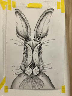
The second artist I looked at is James Hollis who made a series of hare images using different medias such as charcoal & watercolour. He presents hares in a free & expressive manner, unlike Anna Rzaeva who creates more realistic illustrative pieces. I like the looseness of the charcoal drawing as it holds a lot of emotion through the shadows on the face, the shaggy fur & the long whiskers.
I created a continuous line piece inspired by his work using a mixture of fine liner & charcoal. I wanted to get the basic form of the hare so I used curved shapes which separate different sections of the face. think this gave the piece a more cartoony feel, however it doesn't look as expressive & free as I set out for it to. Although its still quite neat, I like the wild & animated look it has.
Andy Thomas creates artworks of wildlife & animals made up of hundreds/thousands of different individual triangles. He uses a mixture of medias including traditional watercolour, ink, pencil techniques, & digital art.
His work looks geometric & collaged; the way he uses varying tones create depth. His work is very different from my own, but he also focuses on the frontal view of animals which reminds me of my continuous line piece. Collaging using different tones / blocks of colour is something I would like to try as it gives the piece a a slight 3D effect. The highlighted parts stand out especially, on the nose & tongue in particular, as they add simple but effective detail to the piece & prevent the image from being flat.

Comments
Post a Comment