For my exhibition piece I wanted to follow on with doing string work as I loved the way this turned out previously. This time my main focus was to push forward a contrast between life & death, along with the idea of history / time repeating itself. The idea of everything cycling right from the very beginning is an important pattern in history. Life continues as does death, with people, animals, & nature. The events that happen in the course of one life time tend to repeat in slightly different ways in another lifetime. For example; wars, terrorist attacks, illnesses, political events, protests, monarchy etc. Life is a continuous cycle right until death & even after.
To begin, I drew some thumbnail sketches of possible ideas I could then push forward.
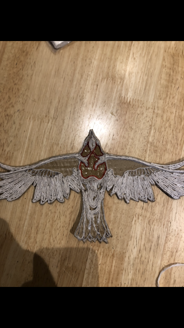
After looking into the bird symbolism even more, I decided a robin would best fit this piece, as robins symbolise renewal of life, as does a phoenix. However, a phoenix is a mythical creature. It isn't real, making it harder to show within my work. A robin has a red chest, which some what pushes forward a similar effect to a phoenix, so I wanted to make sure I included a pop of red within the piece.
REFERENCE PHOTOS
When I was taking pictures I wanted to try to flip & overlap one image of a hand so they look similar to a hand shadow for a bird. I originally wanted the two hands to be symmetrical, however after photoshopping them, I felt like it wouldn't look natural to take a picture of hands already in this position so I took pictures of someone else's hands instead. These turned out a lot better & looked a lot more natural. The lighting was much better too.
I used this image of a hand skeleton & sketched out one hand from the image using tracing paper, with the skeleton inside so it lined up to the original image of the hand.
These are the reference images I used for the robin, however the first image is an American robin,
which are slightly bigger & have a different red spot to robins in the UK. I wasn't going to include the red chest until id seen what it looked like after putting the string in place first with the rest of the piece too, as I didn't want it to contrast with the background.
THE PROCESS
I wasn't sure if I should fill the hand on the left with string like I did for the skeleton hand at first, but after seeing them both complete, I realised if both had the same effect, they would clash too much. They had a nice contrast being slightly different to each other. The small lines of string in the left hand stop it looking too empty & plain, & the way the string swirls in the skeleton hand works really well too. It gives them more shape in a way, & emphasises the curved edges of the bones.
I did accidentally spill KFC beans on the left hand, so I had to peel dry beans off he string & cover the rest with more thin cardboard. It looks fine now though. Hopefully it doesn't smell bad when it comes back from the museum. From this I learnt to keep wet food (like kfc beans) far away from my work.
After sketching out the bird, then tracing it, I decided I didn't like how off balanced the wings were as it looked wonky above the hands, so I decided to trace the right side again & flip it onto the left so they matched. I like things being symmetrical (as I have said many times before) so I felt like this was necessary to make the piece look more pleasing.
I tried to use different thicknesses of string throughout the bird, because some parts are more delicate & bendy than others. I wanted to include some of the smaller details, particularly on the head of the bird. This was definitely the hardest part & it took me a very long time to separate the string into small individual strands. Now I am writing this I have realised I could've just used sewing thread, but oh well. It was worth it I guess.
This is the layout of the completed string pieces put together on the board for the frame. The glue was still wet so the bird looks a little patchy & dark, however they definitely worked well together. It was at this point I decided to do the red chest on the robin as I felt colour would improve the way everything looked, & make the robin look more like a robin. Red would pop out against the rest of the piece as the background was going to be black & gold, so it wouldn't clash.
I used a shiny red thread and swirled it round right to the centre of the chest. It ended up looking really pretty in my opinion.
For the background, I painted the board with a layer of black acrylic paint, however this did not work at all as the paint was not thick enough & just absorbed into the board. I went rooting in my shed & found a really dark blue indoor wall paint which I ended up using instead. It looked really light at first, until it dried & looked almost black. It worked really really well against the gold leaf & string pieces when I put them against it.
I then drew a circle in the centre, and started to plait string in a really long line for the outside frame of the circle. This was also quite time consuming but was an extra important little detail to tie the piece together.
After this I used a brushed glue on the circle, completely covering it, then I placed the gold leaf in a wrinkled way, pressed it down lightly then brushed off loose parts.
FINAL OUTCOME


Comments
Post a Comment