SUPERSTITIONS
SUPERSTITIONS
I wanted to explore superstitions as part of my project because they can be a comfort for people after the passing of someone. I spoke about some examples on the memories & comforts page.
Sometimes it can be seen as a symbol rather than a superstition; ravens for example are a symbol of death & misfortune. This is due to their dark appearance, croaking call & their diet of carrion. In stories they act as phychoprompts, connecting the material world with the spirit world. If a Raven visits you, some people believe it means you are in need of some kind of guidance. It depends on which way you choose to look at things, a lot like people saying a black cat crossing the road is good luck/bad luck.
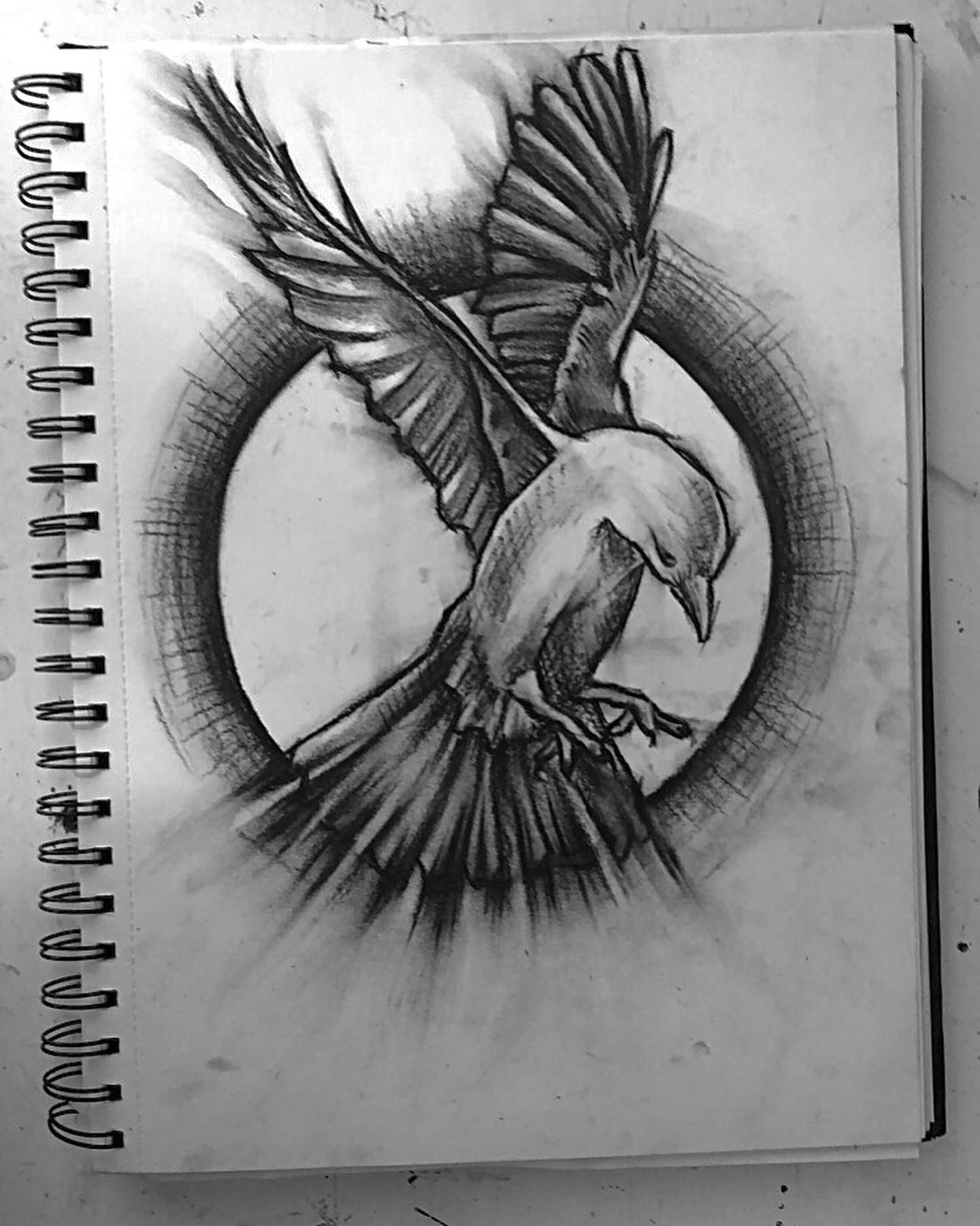
For this first piece I used a reference photo I found off Pinterest & sketched it out then places a circle round it to give a background. I wanted to use charcoal to start with to create a more expressive piece & to help show movement & flow as it’s easy to manipulate & blend.
I do like the way this piece turned out particularly because of the wings as they make the bird look as though it’s flying, the trails that are coming off the wings work well with the piece & give a gloomy dark feel to the piece. One thing I dislike, however, is the tail feathers of the bird. The way they spread off looks too uniformed & straight. They would look better if the individual feathers were going in different directions, some overlapping for example. I then could’ve given them more flowy shaped trails which would have kept the smooth & free feel to the piece.

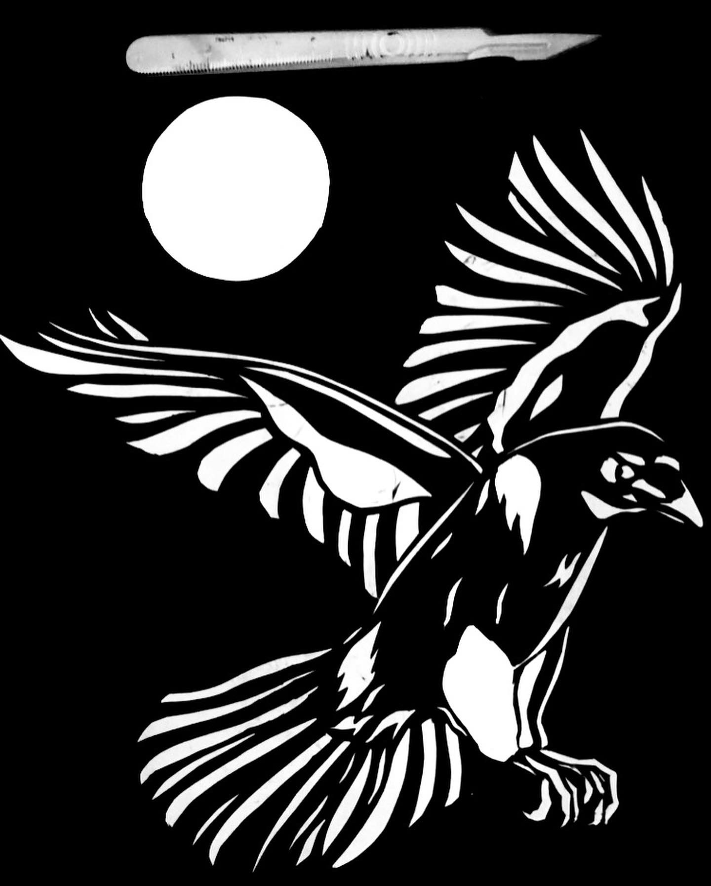
The second piece was also inspired by a photo I found off Pinterest as I can’t take pictures of ravens.
I sketched out the image & then cut out the lighter sections of the bird using a more flowy technique on the wings & tail, & a more blocked detailed technique on the body of the bird.
The wings definitely give this piece more movement similar to the last piece. The most challenging part was making sure I didn’t over cut the feet as if I cut into another section, the cut areas wouldnt have connecting parts & it would just turn into a blob. I managed to avoid this though & they ended up turning out how I wanted them to. This is a much bolder piece compared to the other one as its a lot neater & the lines are more precise. The V shape in the wings looks good composition wise with the moon out from the centre of the V. It creates a triangle which creates a pleasing composition that’s satisfying to look at.


I decided to invert this image using an app on my phone to play with the colour of the piece. I think both images look really strong & wanted to double them so they were facing one another so I used CapCut to flip the white image & line them up with one of them facing each other & another facing away from each other.


I think both images look good together in both ways, & could possibly make an added on final outcome if printed out on a larger scale so I would like to use this as part of my final outcome for the exhibition, possibly with one either side of my final piece.
Overall, I feel the positioning of the bird compositionally looks better in the cut out rather than the charcoal drawing as the body itself looks looks more slim & less spread out which makes the bird look more & sophisticated. The cut out looks more mysterious
RELATED ARTISTS:

Nicklas Gustafsson
This Raven piece done by Swedish artist, Nathan Gustafsson who specialises in graphic design & photography of dark imagery often featuring birds, cities & samurais.
This is a painting of a Raven in flight with its mouth open. It’s a dark image with an intimidating & spooky atmosphere due to the raven being in flight with its mouth open. The image itself is quite similar to my raven drawing based off perspective & motion. All three have their wings trailing off in some sort of way, or just have a free feel to them.
The perspective of the Raven prevents the image from looking flat & stiff, & makes the Raven look more natural.
One thing I really like about this piece is the paint splatters that come off the wings as it gives the piece a more expressive feel. I did similar to this in my first Raven piece by using charcoal to create trails leading off the wings.
The plain yellowish background works well with the image in the way it looks like it’s taken from a notebook, however, it could compositionally be more interesting if there was something in the background.
This piece is similar to the cut out piece I did due to the harsh outline & blacked out image. However, it also had similarities with the other piece due to the trail of the wings & movement within the piece because of this.

Blind Raven - Goran Furjan
This piece is done by a Danish tattoo artist. This image takes a very different approach to the other Raven as it’s much more uniformed & detailed & it is a close up of a Raven head rather than the full body.
The Raven looks still & lost as well as being kind of creepy & sinister. The way the feathers are drawn makes the bird look wet which sets the mood for the piece as being an emotional piece.

Comments
Post a Comment