LINO PRINTING
LINO PRINTING
Lino 1:

This was my first time ever trying lino printing. My original idea was to play with this style of face which I would normally draw as doodles rather than an actual art piece, but I thought it would be interesting to try with lino due to the bold colours & little detail in the drawing.
I began by testing the lino on some thin white paper at first, then switched to brown paper so I could see the outcome when printing onto different textures & colours.
The Outcomes:


I think the brown paper pieces came out stronger than the white paper pieces as the colour came out a lot smoother on the brown. The red on the white paper ended up having line imprints which I figured was because I used too much ink, so for the next few I made sure I used less ink & rolled it out more evenly across the lino. All the pieces have small creases on the paper too from putting the lino through the rolling machine which could be prevented if I had made sure to lay the foam blankets over the paper slightly more delicately. Another issue with these pieces is the large amount of cut out space made it difficult to know which parts had been cut deep enough & which hadn't. You can't see which spots you missed until you've put ink on the lino. This meant that you could see small lines & dots of ink in the empty spaces. The lines in the piece are slightly messy too as I hadn't got the hang of it yet. However, as this was my first time trying this type of printing I am happy with the outcome & definitely wanted to try it again with slightly different imagery as I now knew what worked well & what didn't. I think the art style worked well as a lino print & the outcomes were good for a first try.
I think emotion was presented well through the facial features too & the expression on the face which makes the man look concerned & shocked at the same time, depending what side of the face you look at. The eyes definitely determine what emotion you pull from the piece.
Lino 2:

This is an image of the second cut lino I made with ink rolled onto it which is a similar style to my first one, however it has a line filled background with less open space & a slightly more human-like face. This style reminds me of Yofukuro's work as their portraits have exaggerated facial features & elongated faces. They produce acrylic paintings & charcoal drawings and their work produces a similar emotion to that of which I want to produce in my work. Yofukuro is an art account which includes two Japan based artists who create collaborative art (Seiichi Terazono & Daisei Terazono). Yofukuro's work is my main inspiration for my current project as their focus is on distorted features which create a look of discomfort & dysmorphia which relates heavily to my ideas based around this topic. The colour pallets they use work really well with the style, & the mixture of soft & sharp ragged lines have a strong impact on the feeling that's produced through the work. The colours he uses also have a large impact on the way the final outcome is presented & the mood created; everything works in unison & in my opinion Yofukuro creates some beautiful images through the way they use colour, techniques & media to bring the piece together. From this, I know I need to consider every aspect that makes up the piece in a well thought out manner to help push forward my overall intention & message I'm trying to create.

The outcomes:
 1.
1. 2.
2. 3.
3.I think this lino was my favourite out of the 3 different images I created as everything works better together & it looks like a complete piece. Firstly, I think the background really compliments the head. The way the lines are curved to match the wavy feeling of the face & how certain parts slant in the opposite direction to the background balances the piece better.
Tom Fedro:
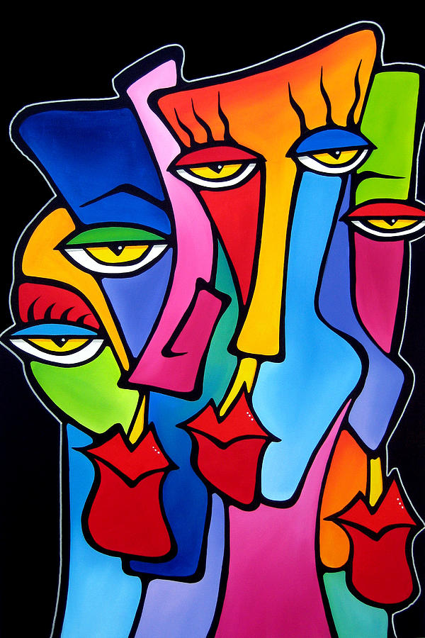

These lino prints remind me slightly of some of Tom Fedros work. He produces these pop art abstract faces with large lips, long noses & curvy heads. The style is very different, but he also enlarges features in an abstract sort of way using bright colours.

For this piece I wanted to look into morphing two faces together as one of my focuses in this topic is face distortions. I drew a sketched version then went over it in fine liner, then traced it onto the lino. I realised the centre where the faces connect looks like a weird face itself, so I got rid of the two curves in the centre when doing the lino cut. This design makes me think of Siamese twins but resembles the way we only see our own reflection & never from another persons perspective. We see ourselves completely differently when our image is reversed, when in reality it's how we are seen by others & probably looks the same to someone else. We are the most connected to ourselves. Arguably, we know ourselves better than anyone else & have more power than anyone else does when it comes to choices we make, & the path we take in life.

The lino cut with ink:

The Outcomes:


My favourite prints are the ones done with the deep blue ink as the colour is bold & vibrant which makes the lines stand out really clearly compared to the others. The red print on the brown paper I think works well, but just isnt as strong as the blue as the brown paper stops the lines from standing out as much. Some of the blue ink stuck in the lino blocked the lines up in the red piece too, which made the lines thinner & some of them you cant see as well. I do like the colour though, & I think the faces look softer & more delicate than in the blue prints because of the softer colour choices.
The grey piece is my least favourite as the ink was splotchy & some of the lines aren't visible at all. I think this was because I had done this piece last & couldn't clean out the lino properly.
On the second image, I realised a few things I had missed when doing the lino cut, such as one of the pupils wasn't cut out. Sometimes its hard to see what you've missed when cutting the lino until you actually put the ink onto it. However, this issue is easily resolved & it's better to forget something than to do too much as you cant take away what youve already done.


Comments
Post a Comment