FINAL OUTCOME PROCESS
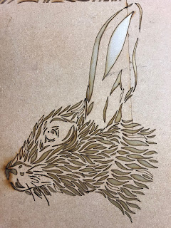
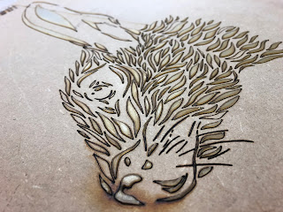
To start off my final outcome, I needed to learn how to create prints. I began by sketching out 3 separate stencils, the blank space being the parts I will then cut out in order for the ink to pass through. One key thing I leant during this is that you have to have connecting parts so that the piece doesn't fall apart. For example, the lines round the eyes are all connected because if I cut them out separately, they would have nothing to hang on to & would not join with the rest of the stencil.
I did 3 stencils (one for each colour) of different sections of the piece. Layer one was the base colour, two was the mid-tone which was going to be used for the eyes, mouth, horns, & below the eyes, then three was going to be the darkest colour for the deepest parts of the eyes & mouth.
Stencil one turned out really well; the majority of the pages I produced were smooth & evenly coloured. However, when we started running out of ink, the image became more patchy. This made the images look a bit more rustic & unique so it didn't end up being a negative.
I then tried to do the second layer but I made the silly mistake of putting my stencil on the screen the wrong way which flipped the image as the drawing wasn't perfectly symmetrical which stopped it from lining up with the first image. I ended up ruining both stencils as I didn't realise my mistake until it was too late.
The stencil sketch:


Layer 1:

Layer 2:

Due to the layers not lining up, I decided to experiment with adding different things to my prints to make them look less plain and see what effect they give. For one of them I used gold ink & drew in all the parts from the failed stencils I created & added extra details round the edges & in the horns too.

The colours give a slightly Egyptian look to the piece. I think the gold & blue work well together & the details I put in definitely make the print look finished.
After working on screen prints & learning how to do them I had the idea of creating a stencil out of my hare piece which I can then use to print onto some sacks. To do this I took a picture of the image & created a laser cut version of it onto plastic because I didn't want the paper to tear & I can use the plastic version as many times as I like.

The images below are of the wood that was underneath the plastic stencil. The shiny parts are the leftover cut out sections from the plastic. I thought I'd include this as I liked the texture of the raised parts & how all the parts were stuck to the wood.
Wood from the Lazer Cut Stencil:
The Stamps:


While lazer cutting my stencil, I also created some small stamps that I originally wanted to use for a tick sheet as an interactive activity for children who go to Newstead where they would spot the hares & stamp them onto a sheet. After producing these & testing them, unfortunately they didn't work as the design was too intricate & small, so I scrapped on this idea. I was going to develop these but couldn't due to facilities being shut & some staff not being in, however this was what brought about the idea of creating a chess board using the small stamps as chess pieces.
Final Outcome (1):

For the final outcome, I ended up using black spray paint instead of doing a screen print because I had no time to use the print room. I definitely think a screen print version would have worked a lot better & would've come out a lot smoother as the spray paint ended up spreading outside of the stencil. The good thing about the ink spreading is that it spread in the right places. The areas it went over makes the hare look shaded & doesn't really look like it was an accident as the dark is in the naturally darker areas on the hares head. On this first sack I added drips to the top where the string is to push forward the idea of poaching as it has a resemblance to blood. I think this works well with the hare, however it may have looked better in red. I could've developed this idea more by adding another stencil layer over the top in a different colour. This would've pushed the image forward & would've made the piece stand out more overall.
Final Outcome (2):


Outcome 2 definitely turned out better as I tried to keep the stencil as close to the bag as possible by weighing it down with stones. This helped but some paint still bled through. The piece ended up looking smoother where it bled over rather than blocked shadow. I also sprayed the bag with white spray paint & let that dry before I did the black layer in the hopes of stopping this from happening. I think this helped slightly but the main problem was the stencil not laying flat on the bag.
I went over some areas with a black sharpie to make the lines look more prominent.
Unfortunately due to not being well, I wasn't able to put my work into Newstead Abby which was a huge missed opportunity. However, I am overall reasonably happy with the outcome I managed to produce in the short time we had for this project.
I do wish I got the time & opportunity to create a chess board instead using the small circle lazer cut 'stamps' I created, as I feel this would have better suited the environment we're putting out work into.
I also feel the message/story behind the piece would've been clearer with the chess board than with the sacks as not everyone would instantly that this piece was related to the duel between Lord Byron & his neighbour.

Comments
Post a Comment